Categories
Branding (EN) Graphic Design & Illustration (EN) Non classé

Trending Artificial Intelligence Art Generators

Trending Artificial Intelligence Art Generators

Why is Artificial Intelligence Important for Art?

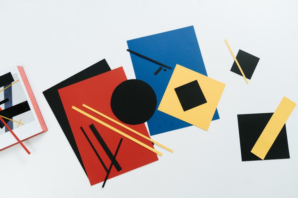
Artificial Intelligence (AI) can be used to generate art and also analyze it. The connection between AI and Art was established after the invention of the computer and numerous graphic designers benefit from it now. Nowadays AI-generated art is in advertising, architecture, fashion, film, etc. 

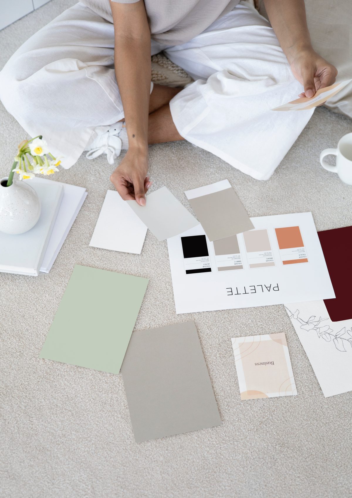
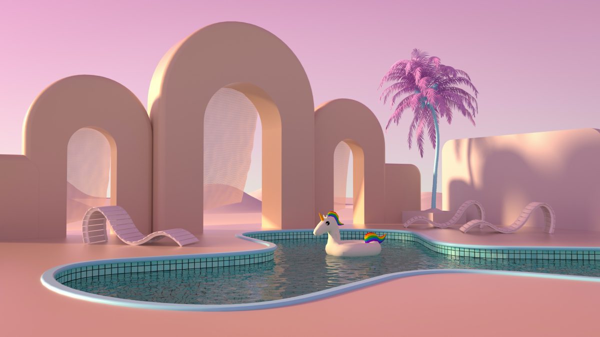
AI-generated art includes numerous realistic and high-quality images and animations. Artists use AI as an important tool and work with algorithms to create high-quality art while staying original. This solution gives the artist capability to generate unique graphics and make art with merely a code.

NightCafe as AI Art Generator

NightCafe is a famous AI Art Generator where you create art with numerous options regarding the desired art style or texture. You can create your image in several minutes and purchase images as well that you liked. You have full copyright ownership and you choose if you want to show your art to the general public or not.

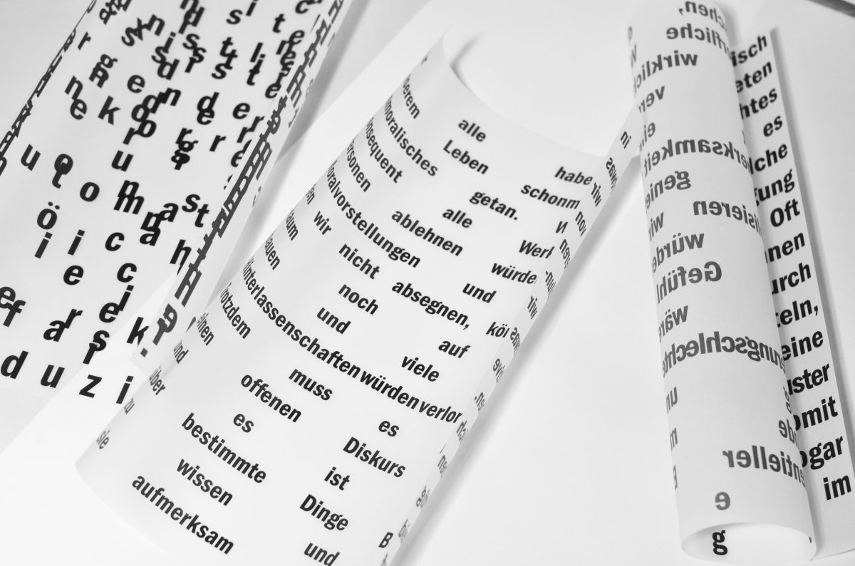
NihtCafe has impressive community features as well, you can follow other users, participate in daily challenges, comment on your favorite creations, turn your creations into collections, etc. You’ll have access to numerous algorithms and have a text-to-image art service as well, which understands your words to create a unique image for you.

Deep Dream Generator

Deep Dream can help you to make more realistic images with Artificial Intelligence. It’s user-friendly and just requires uploading images before the tool will be able to generate a new image based on the original. Because of the different painting styles that Deep Dreams has, most people use it to create artwork.

Deep Dream has several different styles, on top of that creates realistic images, has text-to-image service, can interpret a painting style as well, and is good for creating abstract art.

{CTA_BANNER_BLOG_POST}

Fotor GoArt

Fotor is another option with numerous users and is frequently used to create NFT art as well. It’s beginner-friendly and you can get accustomed to it without much technical or design experience.  Also, you don’t need an account to create or download images.

Again you can just upload an image and choose a style of art that you’d like to apply to it. You can create NFT art more quickly, use different styles and editing options, and also have access to numerous tools that will help you perfect your images.

WOMBO Dream

With WOMBO Dream you can play with different styles and use it as an NFT creator as well. You can use complex algorithms to turn your words into unique pieces of art. You can go for futuristic landscapes as well.

Some of the main features that could make your experience more unique include surreal designs that can enrich your artwork, also transform photos into cartoons, and use various art styles.

How your Business Can Benefit from AI-Generated Art?

AI Art can be one of the biggest steps towards another success, another improvement. With Artificial Intelligence you’d be able to create fascinating characters and develop a story, which will bring your message to your target audience. People love stories and companies always benefit when their storytelling is more creative.

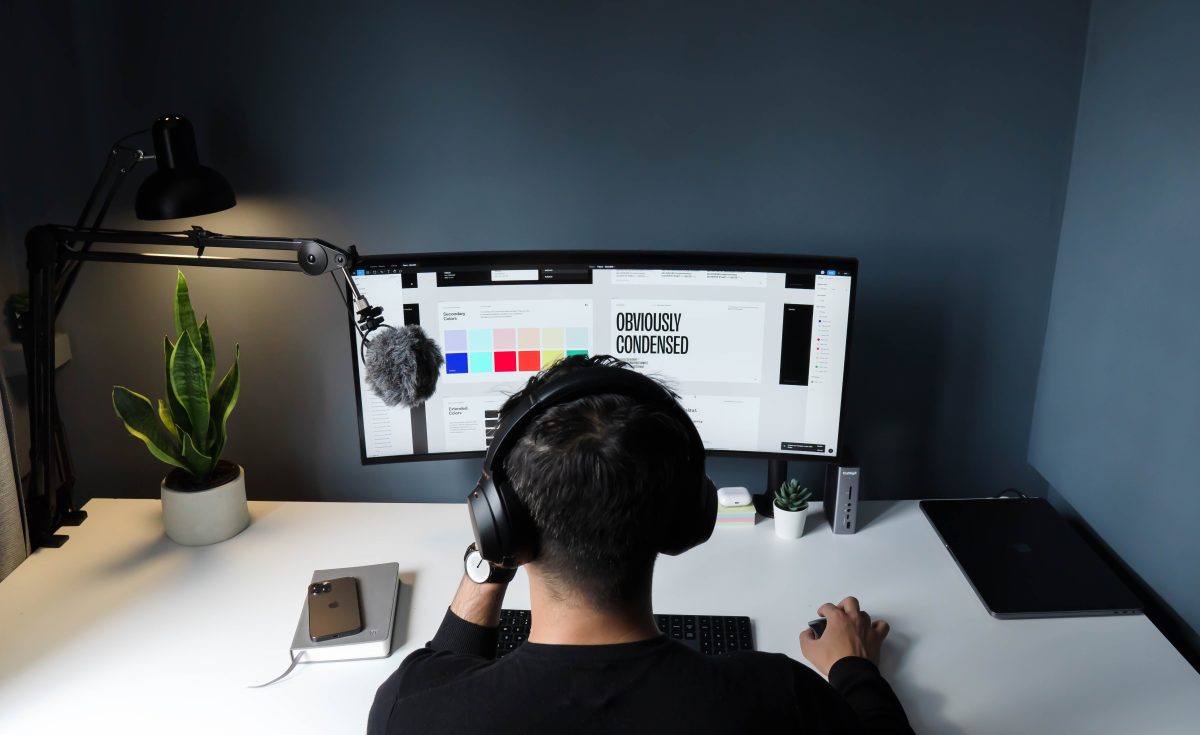
Numerous companies develop games, books, and ad campaigns based on AI. AI-generated artwork is great for developing websites and mobile apps. Another benefit is the influence that it could have on marketing since creativity and marketing are always connected. You could create logos and other branding elements.

Software that generates art can be used in numerous ways, after determining what’s your goal, you can choose the one that could make your brand stand out via different services.

What We Offer

For more similar articles, make sure to scroll through our Publications on Edana. Your Swiss Digital Agency is ready to provide you with Expert-Level assistance built on customer loyalty, progressive ideas, and dedication. Our expertise includes Visual identity for your Branding Strategy.

Categories
Branding (EN) Graphic Design & Illustration (EN)

Basic Principles of a great Product Design

Basic Principles of a great Product Design

Importance of a Product Design

Product design is the key process that helps us to mix up user needs and business goals to create consistently successful products for different brands.

First of all, we have to go through the research phase, we’ll be researching: people, machines, environment. People include our loyal customers, potential customers, producers, sellers, etc. Everybody could be related to the product life cycle and make some impact there.

Researching machine includes discovering how the human-machine relationship works and getting more information about the current market products and their status.

As for the environment, every object is used in a specific space for different purposes, at different times. 

After that, based on the information that we gathered we need to analyze what could be the potential need of the users and discover how we can follow current trends. So we’ll be able to determine the future of the product and its main purpose and be ready to start working on detailed design.

Balance the Quality and Beauty

Product design sets you apart from other companies, so gaining more in-depth knowledge of your product is a must. Paying more attention to the uses of your product and working on them will increase the quality. But let’s not forget how we get more attention with good product design. When people see something they like, they are more motivated to get it. So when we have a modern and attractive product design, we have a competitive product.

{CTA_BANNER_BLOG_POST}

Make the Product Design Innovative

When we are purchasing something we do it with intent, we know what’s our basic requirement and look for products that will fulfill them. However, with so many companies around us, we need to stand out. Innovative product design and sending correct messages to customers are important to make them understand the real significance and uses of our product.

Conducting the User Research

We need to know how many companies would be able to compete against us, and how popular our product is. Would our company make a profitable decision? Would we be able to create something different and useful? After gathering information about our loyal and potential customers we’ll have a better understanding of our course of action.

Design Local, Think Global

It’s not easy when we want to make our product design accessible to the world, because we’ll be dealing with lots of cultural differences and each part of the world will have its own opinion about us. So the explanatory text which comes with the product should be understandable for at least several countries.

Be attentive toward colors, images, advertisements, and other visuals. Analyze your business model to know which countries would be beneficial for you, get to know how Marketing Strategies work in different countries and what kind of Branding Strategies would be available for you.

Modification of your Product Design

When you have a specific direction regarding the future of your brand, changed product design is something that will make improvements easier for you. The world changes around us, trends change, so we have to follow the new steps.

It’s always good when we have information about how other companies are functioning as well because we can observe their products, marketing strategies, their budgets and get some interesting information from their experience.

The process of Designing the Product

It’s important to capture the whole essence of your idea in colors, textures, and looks. Again you have to ensure that your idea wasn’t developed or used before. It’s essential to create sketches about all the ideas you have, to highlight important points, to write about them, and think about how they will be perceived.

After working on the basic structure our work has to become more detailed, it’s important for many different brands, it could be about jewelry and its eye-catching parts or portable consumer electronics. After getting the idea final picture of the product design is as close to reality as possible.

What We Offer

For more similar articles, make sure to scroll through our Publications on Edana. Your Swiss Digital Agency is ready to provide you with Expert-Level assistance which is built on customer loyalty, progressive ideas, and dedication. Our expertise includes Brand Strategy and so much more.

Categories
Branding (EN) Featured-Post-Branding-EN Graphic Design & Illustration (EN)

How Basic Shapes Can Represent Your Brand Persona

How Basic Shapes Can Represent Your Brand Persona

Geometry In Branding

You possibly weren’t very fond of geometry and algebra at school, yet it’s quite unique how the basic geometric shapes can affect viewer’s perspective of a brand. Shapes are extremely important in your branding process, because all of those basic elements have the ideas behind them. In this article we will be reviewing commonly used shapes like: squares, circles, triangles, lines and organic shapes/spirals. Most of all logos are the first eye-catching elements which include shapes as primary elements.

Compositions in Branding

Whether you’re creating a landing page for your website or a print, such as a billboard, composition is to be followed. In general, let’s say you have a product as your main object, body text, also you need space to put your brand’s name and logo. In design we use gridlines for maximum precision for building such visuals. Thanks to Adobe Photoshop and Illustrator getting objects on the parallel lines is not a problem anymore. First you need frame space. In most cases the frame simply has to have twice as much space at the bottom, then sides and the top part which are equal in distance from the far edge of an illustration. Afterwards, depending where your main object is supposed to have more light, it needs to be moved slightly to the side. Putting it in center is not as pleasing for the eye. You could also use the golden spiral composition, if it seems more fitting. All these placement techniques help your visuals be built naturally to meet the eye in a comfortable manner.

{CTA_BANNER_BLOG_POST}

Shapes and Logos

Just as stated in the first paragraph, shapes play biggest roles when creating a logo. Keep in mind, that the logo is that one glyph which must remind your customers about your brand’s name and identity. Let’s review Chanel logo for example. If you break it down, it’s two circles joint in their centers. Remember the circle graphs at school that was used to visually showcase differences and similarities between two objects? Something like that. Now, when you see this logo, you can never mistake it for any other brand, it’s Chanel for sure! Even Apple logo is a conjunction of loads and loads of circles to get this perfectly shaped bitten apple. Also, even when we are speaking of typographic logos, such as Tinder, they were also built in a gridline frame, so whether we like it or not, geometry gives a real helping hand for logo creation process and usage of blank space in general.

Psychology Of Shapes In Branding

In previous article we have spoken about 12 classic brand archetypes for developing brand persona, now let’s discuss classic shape psychology for your brand’s key visuals.  

Circles In Branding

Circles in branding carry the following ideas of Positive Emotional Messages, Unity, Commitment, Strength and Steadiness. For example, Audi has four connected circles. It has its own backstory of course, but in this case the brand persona Is very self-confident and steady as a persona, so circles fit in just right.

Squares In Branding

Squares are sometimes used to emphasize the main shape of brand’s products sometimes, like Microsoft or let’s say Lego which has a brick as background to its typographic element.  Yet squares generally stand for balance, stability and reliability.

Triangles In Branding

Triangles are generally tricky to work with, considering some superstitions in several cultures as well. But, if used creatively it somehow shows the conceptual direction of your brand. Triangles generally stand for concepts like: Masculine, Edgy and Powerful.

Lines In Branding

Lines carry more of a continuous concept and ideas behind them. In most cases creative brands like Sound Cloud have used lines so far. Yet it’s creative because it really matches their Music Play Platform where the tune is visually presented in the lines alike.

Organic Shapes and Spirals In Branding

Well, when it comes to organic shapes or spirals it’s obvious this element is often used in the fields related to eco-friendly activities. Not only of course, the brand Puma for instance is an exception, the organic shape is simply used relevantly to it’s brand name. The spirals tend to call for movement and indicate sports related branding strategies.

What We Offer

For more interesting articles make sure to scroll through Publications on Edana and don’t forget to check our services to get your Brand in shape with professionals! Fell free to contact us anytime.

Categories
Featured-Post-UX-Design (EN) Graphic Design & Illustration (EN)

How Influential Design Can Upgrade Your Brand Image

How Influential Design Can Upgrade Your Brand Image

Design Influence Elements

When it comes to design in the process of branding and re-branding, there are many types of designs we have to take into consideration. Keep in mind, that it’s the design that meets the eye in the first place and makes your brand memorable in a specific way. This is why re-branding needs the element of re-designing as well to introduce yourself in a whole new light and create a different first impression.

Web-Design Element

Now, let’s consider several design elements which create your brand image. First off, let’s start with Web-Design. As you know today’s challenge is to make a Web-Design that is mobile-friendly as well. There is a blank space in front of you and it’s all up to you how you decide to fill that space and compose the final visual of a landing page.

Work With Your Designer

Sometimes we have a nasty habit of not listening to anyone else once we’ve decided exactly what we want to do. Now, Stan Lee himself said in one of his podcasts to do what you genuinely think is good and not give up on it, yet here is one “but”. When it comes to such a collective project as a brand-image creation you just have to do the teamwork. We have all heard negative feedbacks from both-clients and designers as well when a task is not fulfilled exactly or the creativity was blocked. To avoid such quarrels, make sure you actually work with your designer, listen to them and make it clear what you want exactly. Let the staff propose even most unbelievable ideas at the beginning at least and listen to them carefully. Don’t forget, that brand Identity and Image also depends on the environment you create for your co-workers.

{CTA_BANNER_BLOG_POST}

Research Related Designs

What we want to emphasize here is the influence of design. So far we have spoken about web-design. Research is never too much especially when you really want to know what’s going on-on the market. Checking pretty designs on Pinterest will not be enough in this case. Influence of functional design shows itself through CTR (Click Through Rates) and how often a customer comes back to at least scroll through multiple landing pages even if they don’t purchase products or services. In this case you will have to research through the designs of most visited websites in your field and analyze what’s so special in their designs. Of course you must not copy the design but at least you can get a hint on where to start.

Call to Action Through Design

Functional design created a desire of a visitor to become a customer. An effective logo, an impactful ad, and an organized website attract more potential customers to your enterprise. A call to action will be determined by how strategically you place your designs and wireframes. Are they put in right compositions, are the brand colors being used just as strategically to be pleasant to an eye of the visitor? Where do you place your infographics and why? Is UI/UX actually adapted to the interests of your targeted audience? Well, there are lots of questions you’ll have to answer in this case so strategic calculations are a must.

Upgrade Product Design

Product designing is also another element in your design summary that we should not neglect. The design can be done through completely digital medium, like mockups for example, but photographing your product in an environment it’s conceptually connected to is one of the wide-spread ways to present your product and it works just perfect. Product design requires a whole other point of view to make it sales oriented and neat to the customer. Make sure you don’t leave any of the stated design elements without proper attention. After all, Brand Image does take a lot of time and effort.

What We Offer

For more interesting articles make sure to scroll through publications on Edana and don’t forget to check out our services which include Branding and Design! Feel free to contact us anytime.

Categories
Featured-Posts-Web-Dev (EN) Graphic Design & Illustration (EN) Web Development (EN)

How to Pick Effective UI/UX Design For Your Brand Identity

How to Pick Effective UI/UX Design For Your Brand Identity

Why is UI/UX so Important

As we know, first impressions are a one-time thing, so you want to pick your UI/UX design strategies really carefully when planning your Brand Identity related designs. In previous articles we have discussed a lot about functional color-maps, types and copywriting materials to blend into your visual communication channels accordingly. We can say that UI/UX is a combination of all your hard work which shows itself through the final platform.

UI/UX For Your Website

General Overview

Desktop applications have a different standard to follow when it comes to pleasing its user and well, making everyone’s lives easier. This design field has two sides to it-one that the user sees and the other-which user experiences. To put it more simply, when we are happy for gorgeous functioning of an app-that’s our experience. Tik Tok is the easiest of all Social Media Platforms for example. You don’t have to click multiple times to conduct one simple action on the app. Now Facebook on the other hand is still working on it. As for the Visual Side-Instagram and its dark mode is probably one of those designs the eyes don’t get tired of seeing.

{CTA_BANNER_BLOG_POST}

Desktop Applications

A desktop application has an advantage of having more space to move around and this space must be used as productively as possible. In contrary to a mobile application-where compact designs are what matters and creates a better user experience. Now, let’s go through some basic rules of thumb in UI/UX on Desktop Application:

  • Visibility of System Status
  • Match Between System And The Real World
  • User Control and Freedom
  • Consistency and Standards
  • Error Prevention
  • Recognition>Recall
  • Flexibility
  • User Efficiency
  • Minimalist Aesthetics
  • Help Recovery From Error Situations
  • Documentation
Visibility Of System Status

Inform your users about the System Operations being held in timely manner

System X Real World

Based on your target audience-incorporate the speech elements relevant to them not just fancy field-related words. Your customers must navigate with ease.

User Control & Freedom

Offer your users a possibility of backward steps. Undoing or Redoing previously taken actions.

Consistency & Standards

Make sure you use each icon or User-Interface element for its very own Unique purpose. Avoid double standards on icons and don’t confuse your customer/audience.

Error Prevention

Eliminating or flagging actions that may end up as errors are two possible ways of achieving timely error prevention.

Recognition

Recognizing defects in our design is always easier than recalling them, because recognition involves perceiving cues that help us reach into our longer-term memory and allowing relevant information to re-surface.

Flexibility

Users should be able to customize or tailor the interface to suit their needs of faster navigation so that frequent actions can be achieved through more convenient means. No one wants to waste time switching tons of panels when it can be done in max. 2 clicks.

Minimalism

Minimalist designs are becoming trendier by the day and this design style has also proven to be most functional and easiest for the user to get along with. The less-complicated, the better!

Error Recovery

Designers should be aware, that users cannot understand technical terminology, therefore, error messages should almost always be expressed in plain language to ensure nothing gets misunderstood.

Documentation

When users require help, ensure it is easily reachable, on point to the task at hand and explained in a way that will guide them through the necessary steps towards a solution to the issue they are facing.

What We Offer

Make sure to scroll through more interesting articles in our Publications on Edana and don’t forget to check out our services-which include UI/UX Design Plan along with other numerous services. Feel free to contact us anytime!

Categories
Graphic Design & Illustration (EN)

Digital Architecture : Trends To Follow For More Visibility

Digital Architecture : Trends To Follow For More Visibility

Digital Architecture In Modern World

When we speak about architecture loads on images come popping into our minds. It could be Duomo Di Milano or Sagrada Familia Barcelona. Now those I bet you must admire at least for monumental properties are classics. It’s a cultural heritage still dropping jaws of its viewers, yet modern architecture is not something to neglect.

Modern architecture is a part of our daily life and play a huge part in how we feel in the surroundings. You are less likely to feel the rush of picking up a Starbucks Venti sized iced Americano in Los Angeles then you would in New York.

Architecture almost dictates your lifestyle and even though certain basics haven’t changed-new and digital work ethic is quickly taking over architecture fields.

From Paper to Paper Screen

Now, probably you have heard about the special screen covers that make it feel like paper when you touch or look at it. The point of this paragraph is to demonstrate how digital the working process has become.

Back in the days (not too far back) Interior or Exterior designs were firstly sketched on a huge paper but now we have 3D programs, which help us get more realistic images of a planned project and if necessary even send a PDF file of it for example.

Instead of starting on paper, now these projects get printed at the very end of its design process.

Benefits of Digital Architecture

Digital architecture allows exact calculations that provides architects with certainty and allow a diverse amount of complex forms to be created with great ease using computer codes.

The certainty of these calculations also give a bigger advantage of safety. God forbid any calculation goes wrong and this could cost the safety of entire construction.

{CTA_BANNER_BLOG_POST}

Marketing Strategies For Your Digital Architecture Firm

No. 1 in this case is to have a responsive website and well organized communication. The quality of your designs won’t make an impression if your website is constructed poorly.

Digital Architecture is a visual oriented craft so make sure to have a well-organized and stylized portfolio. Give the customer options to scroll through.

Let’s say, a customer wants to have their garden designed but they have to click on full projects and stare at them for hours in panoramic view to see your potential. Give them customized buttons to see everything not just altogether but separately as well.

Make sure to use high quality images on your social media platforms and make a video demonstration of your finished-real life projects as well.

The Ongoing Trends

Reality Capture-Reality capture technologies give 3D modelling a more physical touch. Technology maturation is making more exact and precise forms of 3D measurement easily attainable. Primarily this means an architect doesn’t need to gouge their eyes for numerous calculations anymore.

VR and AR-Virtual reality and augmented reality are becoming popular by the day. These Technologies give designer a chance to fully present what’s on their mind. Like with other elements on the list, improved stabilization of cutting-edge technology is really what allows pros and amateurs alike to experiment with high Tech and find cost-effective ways.

Collaborative BIM-‘Building Information Modeling’ that made the term popular, presented a strategically calculated vision for digital elements in construction. The central premise of BIM was a process of collaboration enabled by the creation of a database-primarily planning environment.

Don’t be Shy-Make It Vibrant

In some instances, design companies might want to stick to realistic color map all too much. Just for the sake of contrast, you can use more vibrant colors and experiment with light touching the surface more. Seems contrary to what an excellent design might look for someone in the beginning, but it’s always nice to see the well differentiated tones in the element of digital construction.

What We Offer

For more interesting articles make sure to scroll through our Publications on Edana and don’t forget to check out our services, which include numerous digital expertise options. Make your digital marketing strategies more efficient with us and feel free to contact us anytime!  

Categories
Graphic Design & Illustration (EN)

Use Prints To Make Your Business Stand Out

Use Prints To Make Your Business Stand Out

Benefits of a Good Print

Prints are probably one of the oldest visual communication tools in the history of mankind and even in the era of world-wide digitalization this tool stays functional to it’s best. Now, once you think on a print that is connected to brands, you might ultimately think of flyers or business card, but there’s more to prints than the basic forms given above.

Before we speak on the importance of prints, lets emphasize how digital modern living is. Back in the days even E-Commerce was seen as a subject of experiment, society and businesses wouldn’t trust it so easily, yet here we are with flourishing E-Commerce examples necessary to grow the business. Somehow, even though any business, which does not provide a digital platform is more likely to be dysfunctional, something funny happened. People started to have a nostalgic feeling of everything that used to be produced on papers. Maybe this is why modern society is so keen on Polaroid Images and Instax Camera has gained so much popularity lately. Society is starving for the images they can hold in their hands and keep in wallets or phone cases or even framed in their living rooms.

Give a Memorable Print

An excellent graphic designer knows, that a simple-yet perfectly aligned printing design can make a customer remember your brand’s name for a really long time. Speaking of examples, let’s discuss the Coca-Cola Campaign. Surely you remember when Coke has names printed on it’s bottles, with the concept of sharing, which is pretty much directly connected to the brand’s core values. That’s one big example of how prints can become lovely memories for certain individuals, some would even use it to find out their crushes names and there are actual memorable histories connected to that print campaign. Coca-Cola connected with it’s customers on a personal/emotional level.

{CTA_BANNER_BLOG_POST}

Be Inclusive

Continuing with the same Coke campaign, it’s important to keep in mind, that prints have to be as inclusive as possible. Now imagine, if in every country there were same names on bottles-the most international ones only, like-Anna, Maria, George etc. We can imagine how many others would be disappointed. The cool thing about this campaign is, that for example based on an insight, that for European citizens it’s sometimes difficult to pronounce certain native African names, Coca-Cola added transcriptions underneath the African names. We can possibly guess the smiles on the faces of those name-holders and that is exactly the point! A happy memory always stays longer than just a memory.

Look from another Perspective

Coca-Cola campaigns are great and can be discussed for centuries, but let’s take a more general approach to the matter. Other forms of prints are: Banners, Posters, Postcards, Billboards etc. Keep in mind, that even though we live in a digital era, there are still people in your target audience who don’t have regular access to digital goods like smartphones or computers. Poster is probably one of the most effective print direction. It can be produced massively, fits almost anywhere and acts as an exhibit in the middle of the street. Poster itself has many styles and can be used for practically any brand. They don’t always have to promote a product, but they can always promote the idea off of which the brand persona is based. For example, if your brand stands for ecology or preventing global warming, all you need to do is find a creative way to express your brand through the poster.

Imagine a poster so fun or aesthetically pleasing, that someone might just want to tear it off the downtown cityscape and take it home to decorate their personal space. That is the type of print we are speaking about-the one which reminds, resonates, connects and highlights the surroundings.

What We Offer

Make sure to scroll through other interesting articles on Edana and don’t forget to check our services, which include the prints as well and Feel free to contact us anytime.

Categories
Branding (EN) Graphic Design & Illustration (EN)

How Does The Right Typography Choices Boost Your Sales?

How Does The Right Typography Choices Boost Your Sales?

Re-Branding Your Type

In the process of re-branding, it’s important to pay attention to your choice of fonts, A.K.A. typography. It is widely known, that the wrong choice of a font style, or it’s size and proportions, could completely ruin the aesthetics of a brand as in full. To set aside the grammar rules and punctuation, how rounded, wide, narrow or fancy your choice of type is, says a lot about the identity of your brand.

UI/UX & Conversion

Typography is just as much of a visual communication language, as your billboards, prints, POS visual components etc. Alongside with the color selection 60/30/10 rule, which you can find out more about in our publications-typography creates a strong visual hierarchy for a customer, especially when they are roaming through several landing pages of your website. Visually speaking, the right type design makes it easier and effective for a loyal and potential customer likewise to navigate through your services. Accordingly, if you have a smarter web-design regarding color balance and typo choices, conversion rates are also likely to improve.

Stronger Visual Communication

By all means, choose wisely which section of your type you decide to put in bold, or italic for example. The words speak for themselves. As simple as that, text areas that are in Bold format automatically switch the brain to thinking-that part is important, I shouldn’t miss out on what’s written there. Italic form of text informs us of an upcoming next paragraph of the text. The trick is to not over or under use the given examples. Because, let’s say, if you highlight more than 3 sections of your publications, or sales/marketing copies in Bold-user might actually get confused, instead of providing a comfortable user experience.

{CTA_BANNER_BLOG_POST}

Logos and Type-Brand Identity

Speaking of brand identity, another very smart way to use type, is for your logo. The types of Logos, which use fonts as the key components are called Wordmark/Letterform Logos. Choosing to re-design your logo is a bold move and if done creatively will at the very least raise the brand’s popularity.

As for example, the NIKE logo is an abstract one, yet NIKE has the huge advantage of world-wide mega popularity, so even if you remove the brand name, we still know who we are talking about. As for the Letterform and Wordmark logos-NASA and Google are the great examples. The list could go on endlessly: Ikea, FedEx, Sony, Facebook, Samsung etc.

The point is, even simply editing the type by millimeters and emphasizing the name-you just catch two birds at a time, the name is present and it becomes a strong watermark for your successful branding strategy.

Improve your Brand Book

Basically the brand book is the keystone of your branding strategy, which includes all starting from founding principles to it’s visual identity. So, it serves as a guide to almost everything related to the use and purpose of your brand. Typo is one of those elements included in your brand book.

Now please, keep in mind, that typography is not quite the same as brand font or typeface, but they MUST be strongly related. To break is down, let’s say we are in the process of re-branding and we have decided to edit a widely known HELVETICA font for our logo, made some simple changes, so now our font and typeface has to correspond to that. It can be: Roboto, Arial, Gibson, DIN Next and Benton Sans etc. Of course it can be Helvetica Neue as well, but let’s not keep it boring and shake it up a little.

Tendencies to stay Updated on

Now, we wall know to make a good Pinterest and Behance researches as our homework when it comes to re-branding and in this case Dafont could be of great help as well, for receiving inspiration and scrolling through hundreds of fonts, which is also kind of fun too. Yet, there are also platforms like: commercialtype.com and type.today to guide us through the choice.
       

Trendy Types to Re-Design your UI/UX with:

  • Axiforma
  • Bison
  • TT Norms Pro
  • Rapor
  • Graphik
  • Boke
  • Lovechild
  • Larken
  • FS Renaissance
  • TT Travels Next
  • Dahlia
  • Marsha

Our Role in Your Excellent Type

       Make sure you scroll through our works and publications, feel free to contact us anytime on Edana for further assistance. Re-Designing and Re-Branding is one of our specialties, so don’t forget to check our services in more detail.

Categories
Graphic Design & Illustration (EN)

Everything You Need To Know About A/B Testing

Everything You Need To Know About A/B Testing

A/B testing means to create two versions of digital asset to check which one works better for customer.

Over the time A/B testing evolved. With the growth of internet users it went digital and managed to cover bigger audience.

Now, it allows you to test more than one variable at once. After conducting the research it gives you a data, which you should interpret and decide whether it will be useful for your company or not.

What makes A/B testing important?

There are several reasons that proves the importance of A/B testing:

  • Minor changes mean major improvement

A/B tests help you evaluate the effects of changes that are not really expensive to implement.

For example, you ran a test about homepage, font, text size, menu titles and etc. you test 3 elements at the same time. When you finish it, you notice that those 3 elements increased conversion by for example 5% each and at the end you will have the growth of the revenue by 15% in total.

  • Low on risks

A/B testing is not only low-cost, but also time efficient. You do not have to waste time doing everything one-by-one, instead you can work with 2 or 3 elements and based on it make decision, whether to implement changes or not.

  • Make the most out of traffic

A/B testing allows you to make your website highly effective by getting more conversion per visitor. With higher conversion the fund and time spent on marketing decreases.

{CTA_BANNER_BLOG_POST}

Where can you use A/B testing?

A/B testing works on this type of customer-facing content:

  • Email campaigns
  • Individual emails
  • Multimedia marketing strategies
  • Paid internet advertising
  • Newsletters
  • Website design

Scientific approach to A/B testing

If you are conducting an A/B testing it would be better to approach it scientifically for better results. The process looks like this: first and foremost is to pick a subject, then:

  • Identify a problem

You have to have a specific information, about the problem. Then look for reasons, why it is not working by going through the lists.

  • Analyze user data

Checking everything that your client clicks after opening your email is time consuming and you will find many things that do not have any connection to the issue, hence you need to figure out which element to target.

  • Develop a hypothesis

On this step you are choosing your method, how you want to test your chosen element and determine how changing that element or elements might fix the problem

  • Conduct testing of hypothesis

With the hypothesis you came up with conduct another testing and compare previous version to the new one with the help of target audience.

  • Analyze the data

After testing, check if the results give you any noticeable changes.

  • Find new challengers

In A/B testing world, words like “champion” and “challenger” are used frequently to describe current best option and new possibilities. When you compare two options and one becomes winner, that one is called winner and when you compare the champion with other tests, those become challengers. This kind of testing brings the best out of everything to the front.

Once you finish all this steps you can than make decision to make changes or leave it as it was.

Pointers for A/B testers

There are some tips you can use while conducting A/B testing:

  • Use similar groups of users as samples

Make sure that while conducting testing use similar groups for the test to be judged fairly.

  • Maximize your sample size

Make sure to use as much people as possible to get well-founded data.

  • Finish the test before making changes

There are times when you get positive results even before the test is finished. But just because you got the results you wanted, does not mean you should let the test end then and there. It will mean that you implement changes using incomplete data. It is a huge risk to do so, since it can impact your results.

  • Do several testing

To make sure that your results have no errors, make sure to run test several times.

Conclusion

A/B testing is the best way to check audience’s response to your projects, which allows you to make changes based on collected information and increase the success rate.

Categories
Branding (EN) Graphic Design & Illustration (EN)

A Helpful Guide To UX Research

A Helpful Guide To UX Research

UX has taken the world to a whole new level. Some companies were able to adapt to the idea, that UX has become more customer-centric, which is an ability to not only meet customer needs, but meet it flawlessly, some unfortunately have not. There are four approaches that need to be taken into account:

  1. Attitudinal – where you listen to what your customers say
  2. Behavioral – where you observe their actions
  3. Generative – it helps you define the problem that you would to create a solution for
  4. Evaluation – helps you evaluate already existing design

Data-based UX: a key to customer retention

Nowadays, having a good product is not enough to attract customers, you have to have a good representation of it by showing to the customer that you care about them, which will result in the growth of your brand popularity.

Do not focus only on opinions, they should also be backed up by relevant data, which can be obtained from social media, since nowadays it has the biggest influence on potential customers. The data that you collected must be thorough, unbiased and comprehensive.

{CTA_BANNER_BLOG_POST}

UX research methods

There are several methods that allows you to conduct a UX research:

  • Remote usability testing

It allows you to interact with the users of your product in a natural environment that it is being used, be it the office, home or any other specific location. Using usability testing allows researchers, designers and product managers to uncover the pros and cons of the product and improve it later on.

  • Diary studies

It is a research that is conducted for a long period and requires self-reporting of how the product works on a long run, what are the good parts and what is frustrating.

  • Card sorting

In a way, it is creating cards with specific descriptions, which will be given to the clients, who will later on sort it out and give it to products based on their experience. It gives you a sense of what direction you need to work.

UX research tools

There are many types of user research methods and they use different tools. For example:

  • UX research survey – which means to design a specific questionnaire about user experience.
  • User groups – focus groups or targeted audience. Ask them about their experience, views or expectations, it is better to involve neutral parties for honest opinions.
  • User interview – one-on-one interview with the targeted audience members.
  • Ethnographic interview – it contains field studies, observation on the environment.

How to conduct UX research in 5 steps

  • Objective

List the things that you need to find out about your users and their needs.

  • Hypothesis

Discuss what information you already hold

  • Methods

What methods are you going to use based on your project type

  • Process

Consists of collecting data, using UX research methods

  • Synthesis

This step is about analyzing the collected data to fill in the gaps, then presenting your hypothesis and creating a plan to improve your product based on all above mentioned information.

Conclusion

In the past, UX research was used to solve a problem that was already known.  For example, if a company had less visitors and they wanted to find the reason behind such unusual low rate compared to others, they would use UX.

But that changed and UX research has become embedded in everyday processes for the teams. It has increased the value of getting fast human insights. If in the past it only focused on problem-solving, now it changed to first find a problem that needs to be solved. UX has become customer oriented and the companies are trying to adapt to these changes, to be more competitive on the financial market.

So can you put up a competition?