Categories
Branding (EN)

Use Corporate Photography To Improve Your Digital Content

Use Corporate Photography To Improve Your Digital Content

Show Your Corporate Image

Photos are most necessary aspects of your visual representation in the digital world. Of course, two-dimensional and flat illustrations have become quite trendy lately, but that type of visual communication might not fit all brands.

The best field of business to discuss will be the hotel management field. Tourism and Hospitality are very dependent on great visual content to attract more customers and maintain the loyal ones. Finding a great photographer is must for sure, and you should also try to have them regularly. If you understand basics of photography, you must know, that each person will take the same shot with the same tools in the same frame, but it will turn out different.

Present Yourself Through Photos

Many enterprises choose to show their working process through photo content. Also it’s nice to present your co-workers and teammates. Especially when the brand environment requires co-workers to dress a certain way or have hairstyles suited to a certain standard.

Even if it’s a creative company with no standards at all, you might still see the pattern of the team’s style and fashion taste. In most cases they match up and create a certain form of unity we like to call dress-code. Showcasing your team visually is a big part of your brand image presentation.

{CTA_BANNER_BLOG_POST}

Trust The Photographer

Just as always, we all have ideas in our heads on what we want our product photography to be like, forgetting that some of the stuff might not be suiting to the brand image at all. Once you hire a photographer you have to actually trust their professionalism. Make sure you check the portfolios before you pick one and discuss your choices with the creative team.

Finding a professional who produces images to your liking will serve you better, than picking a random one hoping they will completely change their photographic style for your images. Also make sure you research your target audience’s interaction with your social media content. Take a good look which images have most likes. A professional photographer that suits your expectations will give you a result better than imagined if you trust their creative mindset.

Pick The Aesthetics Accordingly

In one of our articles we have discussed the importance of color-theory in your key-visuals. The photographer will give you great results, but you must also direct them on how to edit the images. For an easy example, if your brand’s color palette consists of cooler tones like navy or baby blue, aiming for the images to be in warmer-peachy tones will do your website and social media no good. Color contrast might look great in fine arts, but here we have to follow the palette.

Backgrounds Are Vital

So far you have the product you want to capture and the color-map as well. Now, background of the image is our next step. Depending on a product you have to choose the right environment for it to be placed. If you produce versatile cutlery for example with matching plates and all the fancy stuff, putting it on a regular kitchen table would ruin everything right? You will need a table cloth matching the mood and the feeling you are creating for a customer. You want to make them feel luxurious and probably basic wooden table will not match with the luxury vibes, even if cutlery is plain gold.

Team Photography

We love to show off our talented teams and it’s necessary to provide adequate visual content to actually show off the environment we work in. For another example let’s say you have a five-star hotel with VIP guests. Imagine placing images of your co-workers in their daily attire on a background like regular wall in a home. Doesn’t sound quite fitting right? You need to organize a professional photoshoot with plain background. Well, if you have a Hostel that is more concentrated on younger generation and creative atmosphere the suits and ties with grey backgrounds won’t work. It would be much better to have co-workers dressed in a more casual attire with graphitic wall as a background. Make sure you show your brand’s heart and soul through these images.

What We Offer

For more interesting articles, make sure to scroll through Publications on Edana and don’t forget to check our services for professional assistance to build your Brand Image. Feel free to contact us anytime!

Categories
Branding (EN) Featured-Post-Branding-EN Graphic Design & Illustration (EN)

How Basic Shapes Can Represent Your Brand Persona

How Basic Shapes Can Represent Your Brand Persona

Geometry In Branding

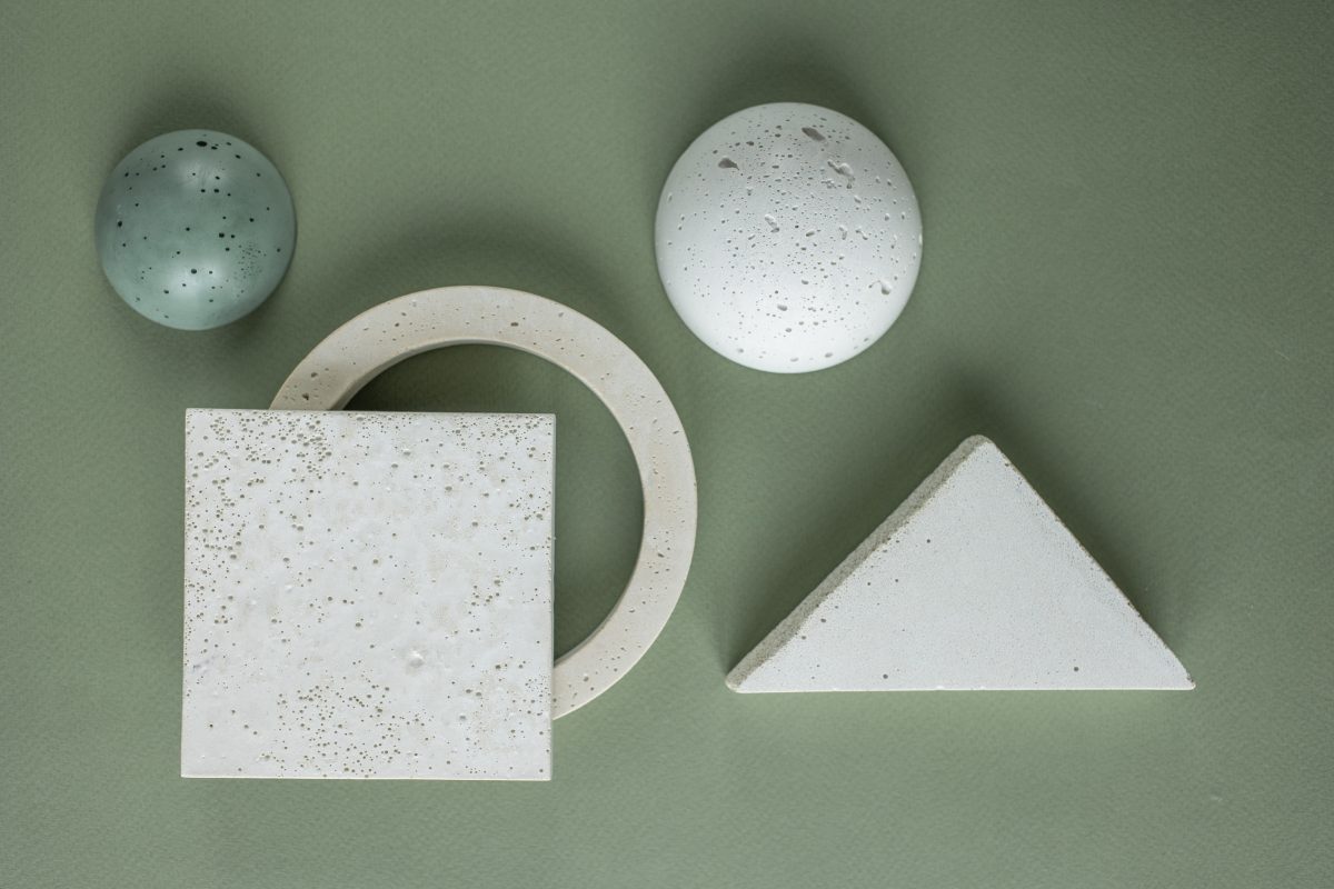
You possibly weren’t very fond of geometry and algebra at school, yet it’s quite unique how the basic geometric shapes can affect viewer’s perspective of a brand. Shapes are extremely important in your branding process, because all of those basic elements have the ideas behind them. In this article we will be reviewing commonly used shapes like: squares, circles, triangles, lines and organic shapes/spirals. Most of all logos are the first eye-catching elements which include shapes as primary elements.

Compositions in Branding

Whether you’re creating a landing page for your website or a print, such as a billboard, composition is to be followed. In general, let’s say you have a product as your main object, body text, also you need space to put your brand’s name and logo. In design we use gridlines for maximum precision for building such visuals. Thanks to Adobe Photoshop and Illustrator getting objects on the parallel lines is not a problem anymore. First you need frame space. In most cases the frame simply has to have twice as much space at the bottom, then sides and the top part which are equal in distance from the far edge of an illustration. Afterwards, depending where your main object is supposed to have more light, it needs to be moved slightly to the side. Putting it in center is not as pleasing for the eye. You could also use the golden spiral composition, if it seems more fitting. All these placement techniques help your visuals be built naturally to meet the eye in a comfortable manner.

{CTA_BANNER_BLOG_POST}

Shapes and Logos

Just as stated in the first paragraph, shapes play biggest roles when creating a logo. Keep in mind, that the logo is that one glyph which must remind your customers about your brand’s name and identity. Let’s review Chanel logo for example. If you break it down, it’s two circles joint in their centers. Remember the circle graphs at school that was used to visually showcase differences and similarities between two objects? Something like that. Now, when you see this logo, you can never mistake it for any other brand, it’s Chanel for sure! Even Apple logo is a conjunction of loads and loads of circles to get this perfectly shaped bitten apple. Also, even when we are speaking of typographic logos, such as Tinder, they were also built in a gridline frame, so whether we like it or not, geometry gives a real helping hand for logo creation process and usage of blank space in general.

Psychology Of Shapes In Branding

In previous article we have spoken about 12 classic brand archetypes for developing brand persona, now let’s discuss classic shape psychology for your brand’s key visuals.  

Circles In Branding

Circles in branding carry the following ideas of Positive Emotional Messages, Unity, Commitment, Strength and Steadiness. For example, Audi has four connected circles. It has its own backstory of course, but in this case the brand persona Is very self-confident and steady as a persona, so circles fit in just right.

Squares In Branding

Squares are sometimes used to emphasize the main shape of brand’s products sometimes, like Microsoft or let’s say Lego which has a brick as background to its typographic element.  Yet squares generally stand for balance, stability and reliability.

Triangles In Branding

Triangles are generally tricky to work with, considering some superstitions in several cultures as well. But, if used creatively it somehow shows the conceptual direction of your brand. Triangles generally stand for concepts like: Masculine, Edgy and Powerful.

Lines In Branding

Lines carry more of a continuous concept and ideas behind them. In most cases creative brands like Sound Cloud have used lines so far. Yet it’s creative because it really matches their Music Play Platform where the tune is visually presented in the lines alike.

Organic Shapes and Spirals In Branding

Well, when it comes to organic shapes or spirals it’s obvious this element is often used in the fields related to eco-friendly activities. Not only of course, the brand Puma for instance is an exception, the organic shape is simply used relevantly to it’s brand name. The spirals tend to call for movement and indicate sports related branding strategies.

What We Offer

For more interesting articles make sure to scroll through Publications on Edana and don’t forget to check our services to get your Brand in shape with professionals! Fell free to contact us anytime.

Categories
Branding (EN) Featured-Post-About (EN) Featured-Post-Branding-EN Featured-Post-Communication-EN

Use these Brand Archetypes To Target the Right Audience

Use these Brand Archetypes To Target the Right Audience

12 Classic Brand Archetypes

Generally, in Branding there are 12 classic archetypes which help you determine the persona and purpose of your brand. So if you know your persona and purpose well enough, logically you have a solid base to target specific audiences without wasting time and resources. Picking the right archetype to relate to is essential. But first, let’s overview the classic archetypes and understand their part in creating a meaningful communication with the related target audience.

The Innocent Archetype

The goal of an Innocent archetype is to spread happiness. It strives to be good, kind, helping, pure, optimistic, with strong moral code and love for romance. As for the overdose of these traits or misusing them in the wrong communications-they might appear naïve or boring at times. Dove soap is a great example in this case, with its soft and almost fragile looking advertisements.

The Regular Guy/Gal Archetype

The goal of this archetype is to belong or connect with others, general surroundings. They are more down to earth, practical, supportive, faithful. Somewhat of a Guy/Gal next door type. The double edged knife is that sometimes this archetype is risking to blend in too much, almost looking uniqueness. Ebay is the closest example of the stated archetype.

{CTA_BANNER_BLOG_POST}

The Hero Archetype

Well, judging from such a bold name it’s easy to guess this archetype wants to make the world a better place. The Hero is strong, bold, courageous, strong, confident and it inspires the customers. Yet, in worst case scenario Hero can turn out to be arrogant to a certain point. It’s all the matter of balancing these traits. Possibly, Duracell fits for this archetype.

The Outlaw Archetype

Outlaw just wants to break the rules and confront authorities, which is fun for sure. This archetype is rebellious and is starving for a change in this dull lifestyle. The risk is to not take it too far, otherwise the Outlaw actually does a great job changing audience’s perspective on certain subjects critically. Harley-Davidson Motorcycles are a great fit for this brand archetype.

The Explorer Archetype

Again, judging by the name, this archetype wants to explore and discover all possible experiences new or daily. It’s adventurous and restless and very independent. Yet, might not quite fit into the mainstream trends due to their very specific traits. Indiana Jones is a prime archetype fit.

The Creator Archetype

This one wants to keep creating until the very end. Something valuable and enduring time. Artistic, imaginative, creative nature. But might be too much of an impractical perfectionist, so be careful with that. Lego fits with this archetype perfectly.

The Ruler Archetype

Guess who’s a control lover? Order comes from chaos is pretty much a motto for this archetype. Just make sure it doesn’t manifest itself into tyranny. On the other hand, organized work-ethic is its Ace. Microsoft is a go-to order lover.

The Magician Archetype

Make all the dreams come true with one swipe of a wand, wouldn’t that be great? That’s what a magician does. The balance must be held though, to stay grounded and not be too selfless. Magician connects the audiences and helps them feel belonging. Apple can be a nice example to this archetype.

The Lover Archetype

Intimacy, Inspiration and Love. Not surprising, but in case of misbalance could turn out to be taken for granted or exploited. Care and love-Marie Claire acquires it all too well.

The Caregiver Archetype

Wants to care and protect others at all times and circumstances, but in a worse can scenario despite being so maternal, could be overly compassionate to the point of annoying. Yet, Johnson & Johnson is a good example of this archetype in a balanced form.

The Jester Archetype

Jester just wants to bring fun and joy to the world. Party and dancing and playing games all too well. Jester has a great sense of humor too. If it’s not crossing the line of disrespectful, Jester’s all good. Ben & Jerry’s fits this one archetype quite well.


The Sage Archetype

This one’s almost like a final Boss. Sage likes to gain wisdom and insight on everything and provides very trustworthy information. The risk is to not become too opinionated. But this archetype does help people understand their surroundings better. Google is a complete sage without a question.

What We Offer

Make sure to scroll through our publications for more interesting articles on Edana and don’t forget to check out our services for Professional Assistance on your Branding journey. Feel free to contact us anytime!

Categories
Branding (EN)

What’s The Difference Between Re-Branding and Re-Designing?

What’s The Difference Between Re-Branding and Re-Designing?

Purposes Of Re-Branding and Re-Design

In many instances Re-Branding and Re-Designing are often seen as the same process. Well, it’s not the same and as a matter of fact Re-Designing is an element of Re-Branding process. Of course this doesn’t put design in a minor position, but it’s simply a different field, in fact what the Branding consists of.

Why Is It Different?

Let’s keep in mind, that design is more oriented on key-visuals. This is why we have a Brand-Book to stay in touch with basic color-map and design particles to make sure our visual content is not too far from our general content. Let’s review an example: You got a new designer in your company and they don’t know much about your visual content strategies. It’s only natural that a designer will try to show their creative potential without taking into consideration what’s your style in general. In a Brand Book you provide creative team with necessary design frames they have to follow to not drop out of context.

What’s So Special About Branding?

Like we’ve already discussed, mere design changes do not equal Re-Branding. Branding itself includes Brand-Image, Voice, Tone, Authority, Communication, Content etc. In order to call it Re-Branding we have to repurpose all these elements and bring change. Brand is pretty much a representation of where you stand and what’s your personality shown through marketing strategies digital or not.

{CTA_BANNER_BLOG_POST}

Re-Branding CAN Happen Without Visual Changes

Key-Visual modifications can have some influence on a company’s image and are more often just a part of the rebranding process. But still, even changing a logo doesn’t qualify as full-on Re-Branding. When a company changes its ideas, their communications, or just try to bring a small change by transforming its core identity – that’s what can be called a Re-Brand. A Brand is always developing; changes have to be made from time to time. To call for a rebrand means drastic changes in direction, not only graphics. Time flies with the speed of flash and a Brand has to keep updates on that time-machine.

Small Changes and Big Impacts

Rebranding a company is quite time-consuming. It could require changing the logo or logotypes in general, also switching colors and basic palettes, new PPTX works, and promo cards. These graphic changes often result in a small upgrade in sales, and apparently, a whole new style. It does, yet not enough to be labelled as Re-Branding. Re-Branding starts with the mission to change processes in the long period of time, creating something that is completely changing the way people see their enterprise. A lot of Re-Branding Projects don’t have enough time and energy to make those changes actually productive, because such changes demand a whole lot of effort. They do generate a lot of positives changes on the other hand.

Review-Adidas

Let’s review the example of Adidas Originals. Now, here we have a brand that is actually not changing its core ideas and stays timelessly trendy. The concept of Adidas Originals is as immortal as Nike’s “Just Do It” concept. What we are taking a look at here is a complete opposite of Re-Branding but an example of how a Brand can strive through time with an Idea that never goes out of style. No matter how many times Adidas changes logos the concept stays the same which screams Success in branding strategy. The tone, image and authority of the brand stays at the top with certain changes in key-visuals for diversity.

Additional Example

Now, let’s say you have an enterprise producing concept related goods on a very specific target audience. You start seeing that the target audience itself is slowly changing its priorities and lifestyle choices, so you have to keep up with them. As a fun comparison, your brand for these customers is almost like a preacher of this aesthetic and lifestyle. You might change the colors and switch to bolder fonts, but it will all be for nothing if core ideas don’t change. Say, you were “preaching” comfort for the past 2-3 years and now you want to add “classy” to your brand vocabulary. This is the idea you want to Re-Brand around. “Classy” will become the sun of your branding galaxy.

What We Offer

Make sure to scroll through our Publications for more interesting articles on Edana and don’t forget to check out our services for Professional Assistance in your Re-Branding process. Feel free to contact us anytime!

Categories
Branding (EN)

Use Infographics To Boost Your Conversion Rates

Use Infographics To Boost Your Conversion Rates

Showcase Visually

Let’s start with the infographics being pretty much one of the very important and basic marketing tools in existence. Creating, sharing and publishing the infographic content is one of the key elements to your conversion rates upgrade. In fact-the field we are discussing takes a whole other staff member to fully dive into the creation process. Infographics can be shared inside content, on social media and in all the other digital marketing out-sources. This means-the given marketing tool is not just functional but flexible as well.

Infographic Marketing

Big part of marketing role in infographics is played by the visual aspect of it. Nowadays it’s extremely difficult to capture the modern customer’s eye. Due to popularized bright and simple images alongside with max. 15 second videos-you cannot force anyone to read or watch your content for more than a few seconds now. The Infographics genially collide these two aspects of B2C communications. They offer a potential and a loyal customer a view that will get attention and a short text that won’t be boring.

Use Infographics Smart

Well, there are basically to ways you can use infographics for in your marketing campaign. It’s either to generate inbound links or to call customer’s action toward sharing your content. Now, of course that is not the only two ways, because all that we have discussed and are about to overview serves the main purpose of boosting Conversion rates.

{CTA_BANNER_BLOG_POST}

Inbound Links

Infographics are rich in color and organized, so they catch the attention. If your content is on target within the infographic, you’ll generate a bunch of inbound links. It’s obvious that the customer persona no longer fancies the boring texts and endless statistics and all the boring dull stuff that was once trendy. Now it’s all about creative expression!

Call to Action

Visual content is more likely to be shared and go viral. And for most of us it is clear-why. It’s more exciting to look at content when its paired with an image or art in any form-that makes the content more appealing. Like we have discussed multiple times by now, visual content is more likely to be shared than a text only. But infographics are a cherry on the cake! They are liked and shared far more than any other type of media content. Of course, if you want your infographic to generate inbound traffic and get shared, it’s got to look great and contain the right amount of information.

Don’t Neglect The Copy

Now, we have spoken a whole lot about the visual side of Infographics, but completely neglecting a copy would not be the best idea either. It’s very common that when we focus on one thing we sometimes completely neglect the other part of it. Now, let’s Say-You have created a gorgeous post with very interesting information formatted beautifully, but decided to not write a caption because well, it’s all in an infographic. That is not the way to go, for sure. Keep in mind that if you take a good look at yourself as customer as well, even if an infographic gave you full information on a subject you would still instinctively check the caption for additional information. What if there is something more right?

Engage The Audience

Educational Platforms on Instagram like Miami Ad School for example have great infographics. Engaging a customer is achievable by adding a question in the caption for example. Even more of fun models can be taken from Astrology Lovers posts. It’s amazing how common interests people relate to can start a conversation. Also, let’s say you have a business in fashion industry that produces cotton and silk. Create an infographic on their special qualities and how you manufacture them and make sure to ask the audience in caption which one do they prefer and why. This is one of the fun ways to upgrade the marketing strategy and gain feedback at the same time.

What We Offer

Make sure to scroll through our Publications for more interesting articles on Edana and don’t forget to check out our services for professional assistance in your digital marketing campaigns! Feel free to contact us anytime!

Categories
Branding (EN) Featured-Post-Lead-EN

Attract More Customers With Brand Content Marketing

Attract More Customers With Brand Content Marketing

The ABC of Brand Content Marketing

To put it in a short Description-Brand Content Marketing is linked with the Enterprise in a direct manner. It’s No.1 purpose is to build awareness about the brand among the targeted audiences and find ways to communicate with potential customers. Needs to be said, that this marketing option is not primarily supposed to be for a specific product or a service.

Communicate Through Your Brand

Now, in the first paragraph we made a note-that it is not necessary to use Brand Content Marketing for a specific product or Service. In this case a Brand that already has its name and image alongside with its voice, tone and authority has to reverse the regular content marketing strategy and make itself the epicenter of communication in the name of creativity rather than just entertainment. I guess you might get confused on small details, but we shall review it as well.

{CTA_BANNER_BLOG_POST}

Every Customer’s a VIP

When you’re a brand you do not just offer a product or service. You offer them a lifestyle, ideas and daily concepts. Customer is a general term, but your customer feels special when you make them feel special. Now, it will be difficult to explain otherwise, but let’s visit the fashion industry.

Currently Balenciaga in conquering numerous Mount Everests in Fashion Industry and wearing it in today’s world is a certain statement for sure. Also, let’s take a look at people wearing their clothes. If we consider celebrities like Kanye or Justin we know quite well they are bold and daring.

Also-the customers which are loving Balenciaga Clothing seem to update their fashion sense quite in a rhythm or recycle the old stuff in a very creative way. In this case-it almost feels like the brand and its customers are like one whole organism cooperating in perfect harmony.

Branded Content

From the great beginnings of Y2K to the modern period-branded content has been a great part of brand awareness process. This is also known as branded entertainment and it stands for the content produced either by an advertiser or funded by one.

Of course the tactics have changed with time, but certain basics still stay. It’s practically a chain reaction and here’s why: If we go back in time there were not as many influencers, so brands had to hind smooth ways to appear in the world. All those Met Galas, Golden Globes and any type of luxurious events-where celebrities mostly had to dress in designer clothes was quite a branded content-especially once it would flow through the press.

Afterwards there was an era of random pink themed blogs providing newly adapting internet users some branded content and let’s not even get started on You Tube Make-Up and Fashion Guru Era.

Currently Trending

Nowadays brands have far more space to roam through when it comes to any type of digital marketing strategy. Also it’s more fun and helps the customer connect with you on a personal level. Currently Branded Content is more focused on video advertising. Let’s discuss some.

Probably you have noticed, that many brands-especially in fields of: Beauty, Fashion and Education have had their YouTube channels far more active than before. Let’s Say-Vogue Magazine.

Vogue is a Classic which has been on the market for decades. You know the brand’s Vlogs with celebrities? Some are Q&A and some are certain self-care routines which could include right about anything. Branded Content is also those reels you often see on Instagram where influencers review a certain product and it also obviously says that it’s been sponsored and posted on their social media Platform as well.

After all discussion let’s summarize types of branded content.

  • E-Books
  • Case Studies
  • Podcasts
  • Videos
  • Infographics
  • Blogs

What We Offer

For more interesting articles make sure to scroll through Publications on Edana and don’t forget to check out our services to make your Branding Process more effective. Feel free to contact us anytime!

Categories
Branding (EN) Online Advertizing (SEA/Display) (EN)

Marketing Strategies For The Telemedicine Industry

Marketing Strategies For The Telemedicine Industry

Telemedicine Marketing After The Pandemic

The pandemic surely left our daily lifestyle changed quite a bit and even our health-related habits. During global lockdown we started seeing the necessity of using internet communications far more actively.

Now, there are actually a lot of benefits to it, which we found out only after the pandemic. Telemedicine had less of a reputation before, but the need of it has created a wider number of customers who got a chance to try and overview their thoughts about medical services online.

Changes and More Changes

We are not really very fond of changes, even when we keep saying that we want something new in our daily lives. The biggest challenge Telemedicine industry had-was to obtain mutual trust. The same was going on about online classes, but guess what? Now even Harvard University offers officially certified online courses which actually teach you a lot and more comfortably.

Like stated previously-lockdown made us do it and then we saw how much we were missing out on. Sometimes it would take months to get a medical appointment. Now we don’t have to go from one city to another or from state-to state just to get a consultation and a prescription. Isn’t it obviously cost-effective?

{CTA_BANNER_BLOG_POST}

Telemedicine Marketing-Best Practices

Show Care Through Your Communication

Remember that your patients are real people with unique challenges.. Be realistic and careful when providing solutions to their situations and wrap your messaging style to speak directly to their specific symptoms.

Educate Your Customers

Create a detailed guide that brings patients through every step of the process, from how to set up an appointment to what type of technology they’ll need. Use video tutorials to make it easier. And make your patients feel more comfortable by sharing a page with doctors and providers that they may see during their online-appointment video, including headshots, bios, and credentials.  

Subtle Digital Experience to Increase Conversion Rates

The pre-visit workflow is vital to telemedicine success. You don’t want to wait until the day of their appointment to learn that they have a technical issue, which makes them ineligible for visit. Make sure that your pre-visit workflow includes steps to assess and test their technology and ability to reach out.

Share Telemedicine Options with Current Patients

Take the time to hone specific messaging for your ongoing base of patients and send them the resources and educational content you’ve assembled. This could be in the form of a newsletter or email blast, promoted blog post content, etc. You can even segment your patients and provide them with content oriented on their particular cases. For older patients, or people with outstanding appointments, call them by phone and offer to schedule their next appointments as online appointments.

Telemedicine can be an Integral Service

Telemedicine makes it possible for healthcare providers to use their time more productively and connect with more patients. It lets continuity of care between providers.

Benefits Of Telemedicine

Accessible Patient Care-Virtual, yet simple, on-demand care – without the usual waste of time and cost. Patients who live in faraway locations, or who can’t leave home or just can’t take off time from work, can access care digitally.

Cost Effectiveness & Savings-Telemedicine also reduces unnecessary non-urgent visits and maximally lowers transportation expenses for monthly checkups for example.

Better Patient Engagement-Not only do virtual visits reassure patients that their providers are available and involved, it makes it easier for them to ask quick questions, report early warnings and make a follow-up appointment to make sure they’re not in any danger.

What We Offer

Make sure to scroll through our publications for more interesting articles on Edana and don’t forget to check out our services to boost your company’s engagement quality! Feel free to contact us anytime.

Categories
Branding (EN)

Skincare Industry Marketing Trends You Should Follow

Skincare Industry Marketing Trends You Should Follow

Skincare Industry In Modern Times

We have all had this pleasure of putting Ice-Cold cucumbers on our eyes and feeling refreshed-as though it performs magic, but now we know it actually stretches our gentle under-eye skin too much and it’s no longer the approved way of getting rid of dark circles. But let’s be honest, it’s still our guilty pleasure. Now, skincare industry has gone through monumental changes, especially from middle of 20th century. Customers became more aware of ingredients and their chemical pros and cons. Now we have to really carefully formulate our products to avoid being in the “Canceled” list for the very least. Modern times have developed this industry to whole new level, so say goodbye to your old ways-it’s time for the new!

The Trends

  • Less is More
  • Celebrity Skin Care
  • Supplements
  • Microbiome
  • Personalized Skin Care
  • Cruelty-free Products
  • Multi-purpose Products
  • Formulation
  • Ingredients
  • Sustainability

Trendy Marketing

Trends are nor just trends-they are certain pathways for you do upgrade your marketing strategies and offer the customers (loyal or potential) what they are looking for. In the next paragraph we shall be reviewing some of these tendencies, which are paid most attention in today’s skincare market. Keep in mind, that these trends are overviewed by influencers on digital platforms such as: Instagram, Tik Tok, Youtube and pretty much anywhere a video content can be posted for real-life demonstration for a product’s quality and capabilities.

{CTA_BANNER_BLOG_POST}

Less is More

In early Y2K everything extra was considered the right amount, but now it’s all vise-versa. Do you remember literally slapping on your night crème before going to bed? It felt like everything was sticking to your face but the belief that beauty was meant to have sacrifices forced us into these absurd actions. Now even the companies themselves tell us to not use an exaggerated amount of product to have steady results. One of the most viral examples of over-using a product was peeling solution from the Brand-Ordinary. TikTok was blown up with customers’ faces looking like sunburnt and of course the image of this brand was under a huge risk of being “cancelled”. Later on we started to have more tutorials on correct application of the product, but it would be better to have been done earlier.

Cruelty-Free

Modern Society is becoming more and more aware on what’s going on behind the curtains of skincare labs. Animal-Cruelty has been an ongoing subject to deal with for decades. Fortunately, certain amount of customers simply refused to buy products generated on animal experiments and the industry woke up from its long coma. Now we have a bigger selection of cruelty-free products and hopefully, maybe in a decade or so-all skincare brands will follow the example and switch to cruelty-free products completely. Sacrifices for human beauty must not be made by any other animal species and that’s common sense the industry has to fully understand!

Formulation & Ingredients

Gladly, brands have become more transparent with their product ingredients. Customers have a wider choice to select a product. If you truly research general elements-chemical or natural which are used for product creation, you might have a better idea what will suit your skin better before you buy the product. Now, consulting agents at the points of sales are supposed to know it all, but still-no one knows your skin better than you. You’ve lived with your skin for all these years and gone through allergies or breakouts that had reasons only you understand. So, take your time researching the product before buying it and it will buy you a lot of time later on.

Skincare Industry and Lifestyle

Skincare is a form of lifestyle. Every brand has its voice, authority and identity on the market –which sells their products. Make sure you keep up with your customer’s needs and do your best to become the part of their daily/nightly routines. Skincare is a huge concept that you have to wisely figure your direction out in.

What We Offer

Make sure to scroll through our Publications for more interesting articles on Edana’s blog and don’t forget to check out our services to upgrade your digital day to day! Feel free to contact us anytime.

Categories
Branding (EN) Featured-Post-Application (EN) Growth Marketing & Growth Hacking (EN)

Gamification Marketing for Audience Entertainment

Gamification Marketing for Audience Entertainment

Gamification Marketing Concept

Let’s start with general modern tendencies. In 2022 a post-pandemic era has come and during the tough years of 2020 and 2021 we’ve all become more aware of possibilities our digital communications hold. Working from everywhere, shopping from everywhere and getting education and even telemedicine services via Google Meet for example has changed our views on daily activities 180 degrees. And guess what? At some Point-It’s a lot of fun! Making the experiences connected to marketing actually fun is the main idea.

Make A Bold Statement

The gamification marketing strategy is an enhanced type of attitude towards marketing possibilities. The given strategy drives the audience/customers to action. It offers them competition for example and the most important-reward! Now, let’s present one example. Say-you have created a certain challenge fit to your Brand Identity and customer interests. This game or game-like activity gives the customer a certain task to complete and after completing the task they get to have a reward-for example: 20% discount on a product or service. It’s almost like a contest.

Give Some Air To Creativity

Offering this type of challenge/competition to your audience opens doors widely to numerous possibilities. For a more fitting example-let’s say you’re a design company, which produces high quality prints for high-end corporations. You create a contest for your customers to create a logo design for example and the smartest design gets to win one of your services fully paid by the company. Scrolling through applications you don’t just pick logo-designs. You are looking through talents! Keep in mind, that a good graphic designer helps you with visual communications, but an excellent one makes a full-on revolution! You might just come up with an excellent graphic designer and if you’re lucky enough they might even want to work with you. See the Bigger Picture!

{CTA_BANNER_BLOG_POST}

Game Elements For Your Loyal Audience

  • Points-Users can collect points by winning a game or each time they purchase something.
  • Badges-Award customers’ badges for accomplishing something.
  • Level-Appeal to customers’ sense of achievement by offering bigger rewards for saving more points.
  • Virtual Currency-Invent your own money to be used only at your store, then use it to reward frequent shoppers, it’s almost like NFT.
  • Leaderboards-Post players’ names and scores on your website or social media to encourage competition.
  • Countdowns-Challenge players to complete a task within a certain timeframe.
  • Progress Bars-Show customer’s progress toward reaching the next level.

The Challenges of Gamification Marketing

Like we have discussed in previous paragraphs-it’s all fun and games, but there is one thing you should know about this strategy. It’s actually difficult to design the visual communication. It’s not just a post or an image-it’s pretty much a connected system of visuals which is more complex than a banner design for example. It’s also challenging because it involves an understanding of motivational psychology with the added goal of affecting user behavior. In conclusion, you have to not only design a game that people want to play but also that achieves your business goals. Quite a combo, isn’t it?

Benefits of Gamification Marketing

Now that we have thrown a little bit of shade on the difficulties which come with gamification, let’s speak of benefits which will surely overpower the previously discussed challenges. Like everything powerful, it needs the right creator and a huge engagement from a whole corporate team. Here are several examples of the benefits gamification will give you for sure:

  • Collect Customer Data in a way that complies with GDPR, CCPA, and the end of 3rd party cookies. Customers may opt to share data with you in exchange for playing your game.
  • Leverage UGC to grow brand awareness. Encourage customers to share their winning scores or photos on social media.
  • Educate your audience. An interactive quiz or trivia game can be a fun way to inform people about your areas of expertise.
  • Increase engagement and reduce bounce rate. Entice people in with the promise of coupon vouchers, free merchandise, bragging rights, or simply a cure for doom scrolling.
  • Drive conversion. If you reward people with coupon vouchers or points, they’ll likely come back to spend it.

Not too many marketing strategies can give you so much to gain from it.

What We Offer

To stay updated on modern trends and many other interesting articles-make sure to scroll through our publication on Edana and don’t forget to check our services. Keep in mind that we have numerous digital marketing services and feel free to contact us anytime!
Categories
Branding (EN) Social Media Marketing (SMM)

Carousel Marketing For Higher Customer Engagement

Carousel Marketing For Higher Customer Engagement

Keep Up With The Trend

Instagram Influencers are quickly taking over. As Social Media is expanding day by day-new marketing trends are showing up. Basically, Carousel ads are a kind of marketing strategy that combines multiple videos or images into a single ad. Carousel Marketing is most popular on Social Media, where you can showcase a number of images. Great way to improve your chances of a conversion or sale.

Breaking Down The Process

Because these types of ads are appealing and interactive-they manage to engage most customers easily. As for further benefit-carousel strategy promotes 72% higher CTR. (Click Trough Rate).

Carousel Marketing Strategy Examples:

  • Presenting Numerous Products at once
  • Showcase the diverse features of a service
  • Highlighting a number of offers
  • Reviewing Multiple benefits of a product or service
  • Getting Focus on reviews or testimonials

Let’s break down the creation process through the Facebook Platform:

  1. Choose the Idea for your Campaign
  2. Choose the Ads Manager
  3. Choose the Carousel Format
  4. Have a clear Idea on a Primary Image, Headline and a Copy

{CTA_BANNER_BLOG_POST}

Standards Can Be Different

The standards for Carousel Marketing campaign can differ throughout the media platforms. Yet at some point, all platforms are targeted at different audiences, so no wonder. At this point the Instagram platform is a treasure box for this given strategy. In this particular case-it helps businesses turn one simple post into an equivalent of a whole campaign. Well, not literally of course, but this is yet one of the most practical SMM strategies, which provides surprisingly great benefits!

The Benefits of Carousel Marketing

  • Increase Engagement-This visual promotion strategy catches the eye of a buyer persona and a potential customer. The ad calls to action as it is far more appealing than a standard picture.
  • Interaction-Even through simple clicking, the customer is already engaging with your content and improving their knowledge about your product and services.
  • Cost-Effectiveness-Just like other functional Social Media Marketing strategies, this one targets exactly the audience that is potentially interested in your content. It’s a huge relief to the financial side of your marketing budget. To put it simply-you don’t use recourses for uninterested customers.

Carousel Posts on Instagram Platform

To engage customers, Instagram which mostly consists of Images and pretty much revolves around them-gives you even more creative opportunities. Here are some Ideas to incorporate this strategy for your Instagram Communication channels:

  • Before & After Posts: Glow Ups are never going out of trend. It’s oddly satisfying to witness something become better. It leaves a feeling of freshness and evident progress. Also, keep in mind, that it’s not an obligation to start with a before photo. The effect of this strategy goes both ways!
  • Share Your Personal Taste-Our taste and the ability to critique our own product if necessary-says a lot about our character and creates a trusting bond with a customer. You can do the unboxing posts and rank them from “whatever” to “favorites” or vice-versa.
  • Speak Up-Now, here is the thing. There have been certain occasions when a brand might overwork itself to doom, without understanding the harm towards customers and themselves as well. If there is something taking place, which temporarily disturbs the regular working rhythm-don’t be shy and inform the customers via your post. Just make sure that it’s appealing at the very least.
  • Keep the Audience Updated-Every field has something new going on each and every day. Make sure to create informative posts about the latest news in your environment. This will affect your relationship with customers in a very positive way and give great results for a long run.

What We Offer

Make sure you scroll through more interesting articles on our Publications page! Also, don’t forget to have a look at our services, our specialties include Social Media Marketing along with many others! Feel free to contact us anytime.