


 Views: 17


Summary – Featuring dynamic blur and transparency effects, Apple’s Liquid Glass promises a deeper, more immersive UI but raises critical readability, accessibility, and UX consistency concerns, not to mention variability across backgrounds, lighting, and device generations that lengthen the development cycle. It analyzes WCAG non-compliance risks, increased technical complexity, and unequal user experiences.
Solution: combine targeted micro-effects, multi-background and multi-device testing, high-contrast fallbacks, and disable options for a controlled rollout.
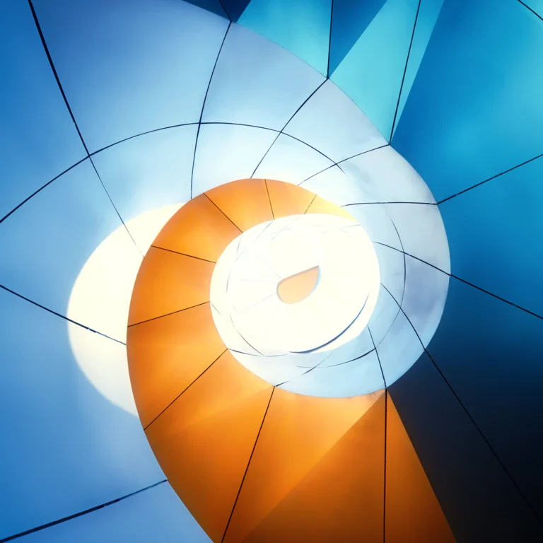
Since the announcement of Liquid Glass, Apple’s new interface layer, conversations have naturally focused on its beauty and aesthetics. Yet behind these transparency and blur effects lies a critical question for every IT team: is this a genuine ergonomic improvement or a hidden regression masked by a spectacular finish? Liquid Glass embodies Apple’s ambition to evolve the mobile UI toward greater depth and contextual dynamism.
But what are the real impacts on readability, accessibility, and UX consistency? This article unpacks the concrete challenges for organizations and suggests ways to leverage this trend without compromising the user experience.
Ambitions of Liquid Glass
Liquid Glass is not merely an aesthetic facelift. It represents Apple’s desire to set a new post-iOS 7 standard.
This interface aims to move beyond flat design by reintroducing depth, micro-effects, and contextual dynamism.
Origin and Goals of the Project
According to Apple, Liquid Glass marks a major step toward a “living” interface, where every transition becomes a perceivable micro-event. The idea is to break away from a flat surface to offer a sense of relief and texture, making interaction more intuitive and engaging.
To achieve this, Apple has developed a system of semi-transparent layers combining dynamic blur and subtle animations. These elements adapt in real time to content and user gestures.
In practice, this approach seeks to rival “neumorphism” effects while maintaining the rigor of Apple’s design guidelines. The goal is clear: to provide a premium, differentiating positioning for both third-party apps and the native system.
Visual and Experiential Promises
Aesthetically, Liquid Glass captivates with its fluidity and organic rendering. Each panel appears to float above the content, creating a sense of depth absent from ultra-flat interfaces.
Beyond the “wow” effect, Apple touts enhanced comprehension: interactive zones stand out more clearly thanks to blurred edges and dynamic shadows designed to guide the eye naturally.
The contextual dimension comes into play when transparency automatically adjusts contrast and saturation based on the wallpaper and ambient light. In theory, UX is enriched by a more immersive experience.
Example of a Swiss Pilot Project
A Swiss SME in the medical sector integrated Liquid Glass into its internal appointment-booking app. The team aimed to modernize the UI and strengthen its brand image with both patients and staff.
The result—fluid and elegant—was immediately praised by users during the initial “showroom” demonstrations. This example shows that Liquid Glass can become a powerful marketing asset.
However, the project revealed the need to finely tune contrast and blur settings for different user profiles, or risk losing readability in key sections (scheduling, critical notifications).
Accessibility and Readability
Transparency and blur can compromise contrast stability. Text readability becomes highly dependent on background content.
This variability risks non-compliance with WCAG 2.1 recommendations and carries legal and business consequences.
Unstable Contrast and Background Dependency
When text floats over semi-transparent areas, its contrast relies entirely on the underlying content. A dark background enhances readability, whereas a colorful or bright image can render text virtually illegible.
Multiple real-world tests showed contrast ratios falling well below the 4.5:1 threshold recommended by WCAG 2.1. Alerts and action buttons can then go unnoticed.
Compliance with Accessibility Standards
Failing to meet WCAG criteria exposes organizations to legal and reputational risks. European legislation, such as the Accessibility Act, now imposes strict requirements on digital interfaces.
To be accessible, a UI must guarantee a minimum contrast between text and background. Liquid Glass, with its adaptive transparency, violates this rule unless supported by reliable fallback mechanisms.
Businesses must plan workarounds: options to disable effects, high-contrast themes, or dynamic adaptation driven by developers.
Illustration from a Training Institute
An online registration portal for a training institute adopted Liquid Glass. Initial visual feedback was positive, notably from the marketing team.
However, accessibility testing by the quality team revealed several form-entry workflows unusable for low-vision participants. Form instructions vanished against certain custom wallpapers.
This case demonstrates that a visually attractive interface can quickly become an operational obstacle if readability is not prioritized from the outset.

Edana: strategic digital partner in Switzerland
We support companies and organizations in their digital transformation
Variability of the Experience
Liquid Glass’s experience varies with wallpaper, lighting, and device generation. Design becomes less predictable.
This variability increases the risk of inconsistent UX and a perception of an “unfinished” product.
Influence of Wallpaper and Ambient Light
Liquid Glass rendering adjusts automatically to the chosen background image. A texture-heavy or brightly colored wallpaper can turn a menu into an unreadable blur.
Likewise, in low-light environments, transparency can appear too pronounced, creating a halo effect that hinders visual focus.
These external conditions are beyond product teams’ control. It becomes impossible to guarantee a uniform experience across all user profiles.
Variability by Device Generation
Apple’s latest screens deliver HDR rendering and higher brightness, showcasing blur and dynamic effects perfectly. On older models, the same code produces a dull, grainy result.
This fragmentation leads to unequal experiences: some users enjoy a “premium” interface, while others see a half-baked tool.
For organizations, this demands extensive testing across multiple device generations and more frequent updates and maintenance of graphical settings.
Example from a Retail Chain
A retail chain deployed Liquid Glass in its internal stock-management app. Newer tablets displayed a crisp, fluid visual, while older models exhibited artifacts and poorly defined blur.
This led to dual support cycles: one team optimizing for iPad Pro models and another manually adjusting configurations on first-generation iPads.
The incident highlights the importance of assessing hardware impact before rolling out a highly dynamic design across an entire fleet.
Business Risks and Best Practices
Liquid Glass can be a product differentiator if mastered properly. Otherwise, it becomes a source of complexity and UX degradation.
Organizations should avoid blindly copying this trend without adapting their design and testing processes.
Legal, Reputational, and Accessibility Stakes
Overlooking accessibility constraints invites legal action and costly remedial work. WCAG compliance is no longer optional—it’s a regulatory imperative in Switzerland and Europe.
Excluding user segments (e.g., low-vision users, seniors) damages brand image and limits the reach of both enterprise and consumer applications.
Executive leadership must treat accessibility as a strategic component, not a decorative afterthought.
Increased Product Cycle Complexity
Designers have to produce multiple mockups for each background state and user profile. Developers implement conditional logic to adjust blur, contrast, and colors.
This technical overhead lengthens development time and drives up maintenance costs. Every iOS or app update may require a complete review of Liquid Glass settings.
Total cost of ownership skyrockets, diverting resources from higher-value business features.
Common Pitfalls and Good Practices
The first mistake is prioritizing design over readability. Any effect that hinders comprehension should be disabled or confined to non-critical areas.
Many teams blindly replicate Apple’s approach without contextualizing their business needs. The result often works in demos but collapses in real-world use.
High-quality products leverage Liquid Glass selectively: micro-effects on key buttons, clearly delineated content zones, automatic opaque fallback when contrast drops.
Crucially, test on varied backgrounds, across device generations, and under real-world conditions before full-scale deployment.
Maintaining Visual Innovation without Sacrificing Experience
Liquid Glass is a true visual advance, but its implementation requires discipline and adaptability. Dynamic effects must remain enhancements, not obstacles to comprehension.
Contextual and dynamic design is a powerful trend, yet each variation introduces risk. It’s wiser to precisely control application areas and plan robust fallbacks to manage complexity.
IT directors, digital transformation leads, and project managers: our experts are ready to guide you through a thoughtful integration of Liquid Glass or any other design standard. Together, we’ll ensure a premium, compliant experience that balances innovation, accessibility, and performance.


