


 Views: 13712


The Importance of Great Logo Design
A logo is a representation or symbol of a company that holds considerable significance and effectively encompasses all of the company’s ideals, objectives, and aims. Its appearance, feel, and meaning represent everything that the firm stands for. They have their origins in ancient cultures that employed images to express words and concepts. The logo is usually the first thing that people notice and remember.
They assist in the development of a company’s brand identity. Their fundamental purposes are promoting trust, recognition, and appreciation for a company or product. It should be simple, memorable, and timeless, while also evoking the feelings you’d like your target audience to associate with your brand.
Logo Types and Their Effectiveness
Wordmarks, also known as logotypes, are made up of the company’s name written in a specific typeface or font. Coca-Cola, for example, created a custom typeface just for its logo. Alternatively, you may select a font that fits your brand’s style. A wordmark is an excellent alternative for companies with memorable names or those seeking to become more recognizable.
Letterforms are one-letter logos that simply incorporate the first letter of the company’s name. Since their designs are small, they are likely to remain recognizable even when used in extremely tiny spaces. They are typically effective for businesses that are already well-known, have long names, or just like minimalism.
Lettermarks, often known as monogram logos, mostly consist of the brand’s initials, such as IBM and NASA. They are a popular alternative for companies with long names that wish to make their names more memorable with shortened versions. Many companies employ graphic icons, symbols, or pictures that symbolize the brand’s identity or activities. They are used by Apple and Twitter, for example.
Abstract logo marks are image-based versions that employ abstract shapes to represent a company’s branding. They allow you to design something truly unique as they don’t represent a certain recognizable object. Mascot logos are graphical figures that serve as visual representations or “ambassadors” for a company. Emblems are still another alternative. They are commonly associated with crests. They use text and symbolic images to create intricate designs with a classic feel.
Combination marks combine visuals and words. They are quite popular since you can create several variants of your logo and use them for various reasons. Combination marks can be an excellent beginning point for small businesses as well. The dynamic logos are one-of-a-kind. They mostly have a fundamental structure that acts as the central theme and is present in all versions of the logo. This works especially well for dynamic brands, such as Google and Nickelodeon.

Edana: strategic digital partner in Switzerland
We support mid-sized and large enterprises in their digital transformation
Showcase Your Brand Identity
One of the most significant aspects of a logo is its brand vibe, which should be in tune with the whole identity of the company. A brand vibe is how you want people to perceive things about your brand.
Often, the form of a logo design is related to the company’s identity and includes essential brand elements. They should be used on everything that bears the company name. An excellent logo design conveys the company’s spirit and is instantly recognizable. It can represent a business in a favorable light and help it to distinguish itself from the competition.
It conveys the company’s ideals and services through a distinctive visual image. Basically, when someone sees a specific logo, they should feel all of the emotions associated with the brand. That is why they must be carefully selected. This one simple image might be the best foundation for the future that lies ahead for any organization. They should be eye-catching, timeless, and memorable. It is important to seek the aid of specialists in order to achieve the best outcomes.
Guidelines for Creating a Logo
A logo’s primary purpose is to visually represent your brand. Use simple symbols to convey your brand’s identity. Don’t overcomplicate it, and make sure it can be recognized from a great distance. Consider where it will be shown while developing it, whether it is on social media or a business card.
A simple logo does not necessarily imply a dull one. Simply use multiple tones of the same color to make a harmonious logo. A simple and memorable logo can be made without the use of lots of colors and little elements. An overwhelming logo might turn people away and damage the first impression.
The logo should reflect the brand’s personality and ideals. Keep it timeless so you don’t have to update it every couple of years. Since renovation is a natural aspect of evolution, upgrading a logo at some time is unavoidable, but it should not undergo radical alterations that mislead customers.
Make a mind map of your brand’s ideals. Begin with a primary topic and try to link keywords and related themes. Getting started is generally the most difficult element of any creative endeavor, but it’s always ideal to find ways to generate new ideas and inspiration from the very start.
Choose the style and ensure that it is directly related to the general vibe of your brand. There are multiple styles available, each one having its value. Vintage logos, for example, evoke feelings of nostalgia. Modern logos are clean and simple, creating a modern, cool aura surrounding your company.
Another critical factor is, of course, color. One research revealed that up to 90% of purchase decisions are solely based on color, while another discovered that color has a significant influence on one’s mood. Aside from that, keeping an eye on competitors and gaining important knowledge from them is always a smart idea.
Avoid These Mistakes When Creating a Logo for Your Company
The logo is the first thing that captures the attention of the consumer. Actually, several brands have larger sales because of the reputation of their logos. Keep in mind that the finest logos do not usually have a wide range of elements and images. In many circumstances, simple and straightforward logos are the most effective. Don’t use too many colors. Starbucks’ simple logo design, for example, uses merely two colors.
Avoid intricate forms. Keep in mind that each shape and form has its own importance. Geometric forms represent specific ideas such as unity, stability, and power. In most cases, basic forms such as circles, squares, triangles, lines, and spirals are employed in the logo creation process. Organic forms are the other type of shape. Take, for example, a leaf. Furthermore, it should be emphasized again how solid color palettes work best for amazing logo design. Brands in the fashion business are a good example.
Don’t overuse fancy fonts. Your font has the ability to affect your customers’ thoughts and sentiments, as well as successfully represent the overall mood and essence of your brand. For example, a serif logo font is appropriate for companies that value timelessness and legacy. Rolex, Prada, and Mercedes-Benz are just a few examples. Sans serif fonts are more simple and straightforward, and they are frequently utilized by online businesses due to their readability on screen. Google, Netflix, and Meta all use sans-serif fonts.
One of the most ignorant assumptions is that logos may be easily produced with free logo generators. You should be mindful when some sources offer various logo makers, logo templates, or free logo designs. Finding logo files that appear to be easy to get hold of, simply dragging and dropping them on a desktop or just downloading a logo for free seems good at first, but afterward poses extra issues. Professional logos include numerous aspects from your brand kit and must be carefully considered. When the company’s goal is to achieve long-lasting and profitable outcomes, executing the entire task using short and easy solutions won’t be enough.
What are the advantages of Edana?
Custom logo design is important for a number of reasons. It is not only beneficial to the company’s revenues, but it also allows you to demonstrate to a larger audience how unique your brand is and what makes your company, as well as its products and services, so exceptional.
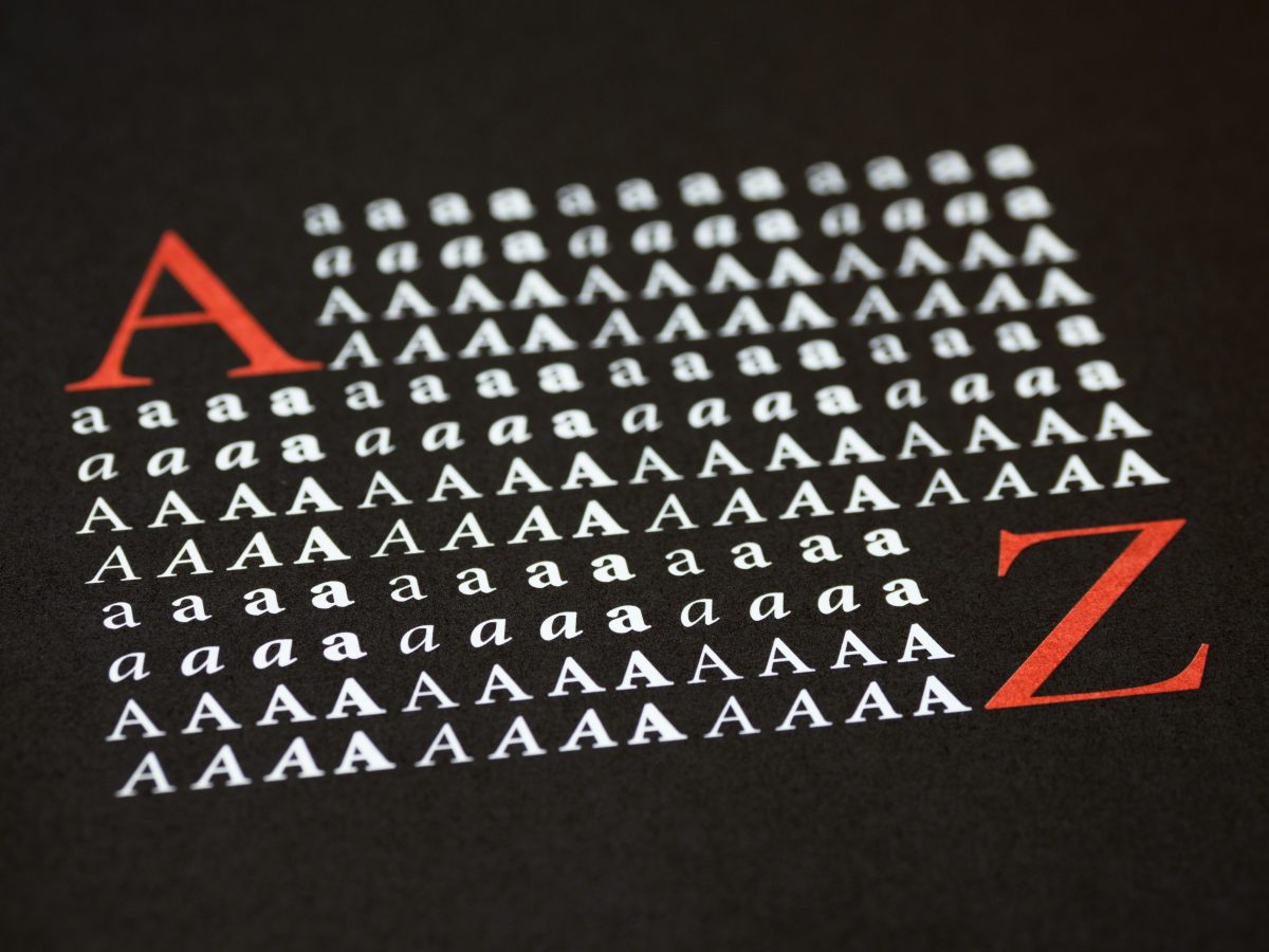
Edana is a Swiss Branding Agency committed to providing each project the attention it deserves and developing digital solutions that our clients value. From A to Z, we cover everything needed to make businesses more distinctive, strong, and profitable. You can benefit from the expertise we possess to obtain tailor-made solutions that would lead you to become a stronger competitor in your industry.

