Re-Branding Your Type
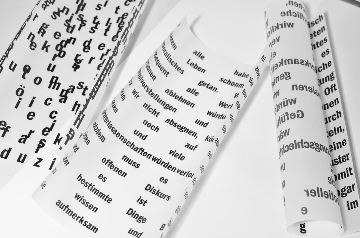
In the process of re-branding, it’s important to pay attention to your choice of fonts, A.K.A. typography. It is widely known, that the wrong choice of a font style, or it’s size and proportions, could completely ruin the aesthetics of a brand as in full. To set aside the grammar rules and punctuation, how rounded, wide, narrow or fancy your choice of type is, says a lot about the identity of your brand.
UI/UX & Conversion
Typography is just as much of a visual communication language, as your billboards, prints, POS visual components etc. Alongside with the color selection 60/30/10 rule, which you can find out more about in our publications-typography creates a strong visual hierarchy for a customer, especially when they are roaming through several landing pages of your website. Visually speaking, the right type design makes it easier and effective for a loyal and potential customer likewise to navigate through your services. Accordingly, if you have a smarter web-design regarding color balance and typo choices, conversion rates are also likely to improve.
Stronger Visual Communication
By all means, choose wisely which section of your type you decide to put in bold, or italic for example. The words speak for themselves. As simple as that, text areas that are in Bold format automatically switch the brain to thinking-that part is important, I shouldn’t miss out on what’s written there. Italic form of text informs us of an upcoming next paragraph of the text. The trick is to not over or under use the given examples. Because, let’s say, if you highlight more than 3 sections of your publications, or sales/marketing copies in Bold-user might actually get confused, instead of providing a comfortable user experience.
Edana: strategic digital partner in Switzerland
We support companies and organizations in their digital transformation
Logos and Type-Brand Identity
Speaking of brand identity, another very smart way to use type, is for your logo. The types of Logos, which use fonts as the key components are called Wordmark/Letterform Logos. Choosing to re-design your logo is a bold move and if done creatively will at the very least raise the brand’s popularity.
As for example, the NIKE logo is an abstract one, yet NIKE has the huge advantage of world-wide mega popularity, so even if you remove the brand name, we still know who we are talking about. As for the Letterform and Wordmark logos-NASA and Google are the great examples. The list could go on endlessly: Ikea, FedEx, Sony, Facebook, Samsung etc.
The point is, even simply editing the type by millimeters and emphasizing the name-you just catch two birds at a time, the name is present and it becomes a strong watermark for your successful branding strategy.
Improve your Brand Book
Basically the brand book is the keystone of your branding strategy, which includes all starting from founding principles to it’s visual identity. So, it serves as a guide to almost everything related to the use and purpose of your brand. Typo is one of those elements included in your brand book.
Now please, keep in mind, that typography is not quite the same as brand font or typeface, but they MUST be strongly related. To break is down, let’s say we are in the process of re-branding and we have decided to edit a widely known HELVETICA font for our logo, made some simple changes, so now our font and typeface has to correspond to that. It can be: Roboto, Arial, Gibson, DIN Next and Benton Sans etc. Of course it can be Helvetica Neue as well, but let’s not keep it boring and shake it up a little.
Tendencies to stay Updated on
Now, we wall know to make a good Pinterest and Behance researches as our homework when it comes to re-branding and in this case Dafont could be of great help as well, for receiving inspiration and scrolling through hundreds of fonts, which is also kind of fun too. Yet, there are also platforms like: commercialtype.com and type.today to guide us through the choice.
Trendy Types to Re-Design your UI/UX with:
- Axiforma
- Bison
- TT Norms Pro
- Rapor
- Graphik
- Boke
- Lovechild
- Larken
- FS Renaissance
- TT Travels Next
- Dahlia
- Marsha
Our Role in Your Excellent Type
Make sure you scroll through our works and publications, feel free to contact us anytime on Edana for further assistance. Re-Designing and Re-Branding is one of our specialties, so don’t forget to check our services in more detail.


 Views: 17176