Geometry In Branding
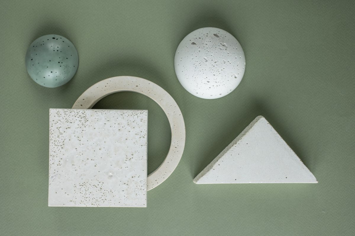
You possibly weren’t very fond of geometry and algebra at school, yet it’s quite unique how the basic geometric shapes can affect viewer’s perspective of a brand. Shapes are extremely important in your branding process, because all of those basic elements have the ideas behind them. In this article we will be reviewing commonly used shapes like: squares, circles, triangles, lines and organic shapes/spirals. Most of all logos are the first eye-catching elements which include shapes as primary elements.
Compositions in Branding
Whether you’re creating a landing page for your website or a print, such as a billboard, composition is to be followed. In general, let’s say you have a product as your main object, body text, also you need space to put your brand’s name and logo. In design we use gridlines for maximum precision for building such visuals. Thanks to Adobe Photoshop and Illustrator getting objects on the parallel lines is not a problem anymore. First you need frame space. In most cases the frame simply has to have twice as much space at the bottom, then sides and the top part which are equal in distance from the far edge of an illustration. Afterwards, depending where your main object is supposed to have more light, it needs to be moved slightly to the side. Putting it in center is not as pleasing for the eye. You could also use the golden spiral composition, if it seems more fitting. All these placement techniques help your visuals be built naturally to meet the eye in a comfortable manner.
Edana: strategic digital partner in Switzerland
We support companies and organizations in their digital transformation
Shapes and Logos
Just as stated in the first paragraph, shapes play biggest roles when creating a logo. Keep in mind, that the logo is that one glyph which must remind your customers about your brand’s name and identity. Let’s review Chanel logo for example. If you break it down, it’s two circles joint in their centers. Remember the circle graphs at school that was used to visually showcase differences and similarities between two objects? Something like that. Now, when you see this logo, you can never mistake it for any other brand, it’s Chanel for sure! Even Apple logo is a conjunction of loads and loads of circles to get this perfectly shaped bitten apple. Also, even when we are speaking of typographic logos, such as Tinder, they were also built in a gridline frame, so whether we like it or not, geometry gives a real helping hand for logo creation process and usage of blank space in general.
Psychology Of Shapes In Branding
In previous article we have spoken about 12 classic brand archetypes for developing brand persona, now let’s discuss classic shape psychology for your brand’s key visuals.
Circles In Branding
Circles in branding carry the following ideas of Positive Emotional Messages, Unity, Commitment, Strength and Steadiness. For example, Audi has four connected circles. It has its own backstory of course, but in this case the brand persona Is very self-confident and steady as a persona, so circles fit in just right.
Squares In Branding
Squares are sometimes used to emphasize the main shape of brand’s products sometimes, like Microsoft or let’s say Lego which has a brick as background to its typographic element. Yet squares generally stand for balance, stability and reliability.
Triangles In Branding
Triangles are generally tricky to work with, considering some superstitions in several cultures as well. But, if used creatively it somehow shows the conceptual direction of your brand. Triangles generally stand for concepts like: Masculine, Edgy and Powerful.
Lines In Branding
Lines carry more of a continuous concept and ideas behind them. In most cases creative brands like Sound Cloud have used lines so far. Yet it’s creative because it really matches their Music Play Platform where the tune is visually presented in the lines alike.
Organic Shapes and Spirals In Branding
Well, when it comes to organic shapes or spirals it’s obvious this element is often used in the fields related to eco-friendly activities. Not only of course, the brand Puma for instance is an exception, the organic shape is simply used relevantly to it’s brand name. The spirals tend to call for movement and indicate sports related branding strategies.
What We Offer
For more interesting articles make sure to scroll through Publications on Edana and don’t forget to check our services to get your Brand in shape with professionals! Fell free to contact us anytime.




 Views: 19075